Sissy-Boy

Sissy-Boy

Grote Markt 12, 3500 Hasselt
Description

[The Retail Design Lab wrote this case study based on an extensive analysis of (and in consultation with) the retailer in question using our tools and scientific insights. This case study is intended to be an instructive 'best case'].

Sissy-Boy is an experience shop located in the centre of Hasselt. The founder of the family business, Michael Smit, opened the first building in Amsterdam in 1982 under the name Scoot. Together with Romy Schneider, who had played the role of Queen Elisabeth (Sisi) of Bavaria, he made a clothing line and changed the name to Sissy because he liked it. The first clothes sold were unisex, then the range was expanded to include men's clothes. To indicate this, 'Boy' was added to the name. The branch is indirectly located on the large market in Hasselt and is located in a new building, combined with a former restaurant. Of these, an old wall has been preserved without plaster, so that the beautiful red bricks are visible. The combination of this rough wall and the new building still gives you a small reference to the past. This wall also emphasizes the homely atmosphere that they want to convey to their customers.

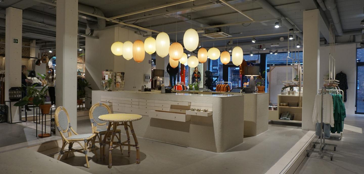
The industrial interior with sober colours and materials is given a warm glow by wood accents, plants and soft textures. The shades used in the design vary from white to light grey and highlight the striking colours of the products. The industrial look is achieved by the rough brick wall in combination with the bare concrete curves and concrete floor. The choice was also made to leave the beams made of concrete visible together with all the drainage pipes, ventilation and cabling. Some of the walls are clad with beige square tiles that give a homely feel. Throughout the shop there are various spells printed on the walls that bring a warm smile to the customers' faces.

The building is situated on a slope so that the ground floor consists of several levels. This creates a playful effect and subtly demarcates the various departments. 

On entering, customers are immediately warmly welcomed by the staff at the centrally located cash register. This forms the heart of the room and radiates warmth through the rich ambient lighting that hangs around it. The furniture has a detailed finish. The mosaic tiles in honeycomb structure fit in seamlessly with the smooth work surface. There are also some drawers at the back which can be used as displays.

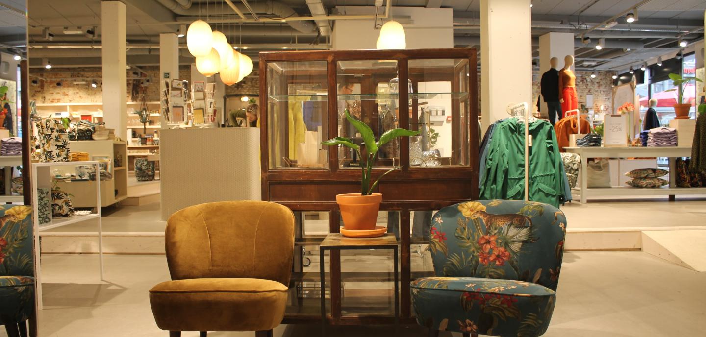
At the front of the shop there is fashion for ladies that flows into the home and care department. A striking element in this environment is a dark brown vintage piece of furniture in which jewellery is displayed. Furthermore, the majority of the clothes hang on white lacquered tube racks that are attached to the ceiling. These are fitted with a wooden shelf on which homeland products or communication boards can be placed. The wooden fitting rooms on the one hand are rather playful, the fitting rooms with u-shaped rails on the other hand are rather cosy because of the textile curtains and carpets on the floor.

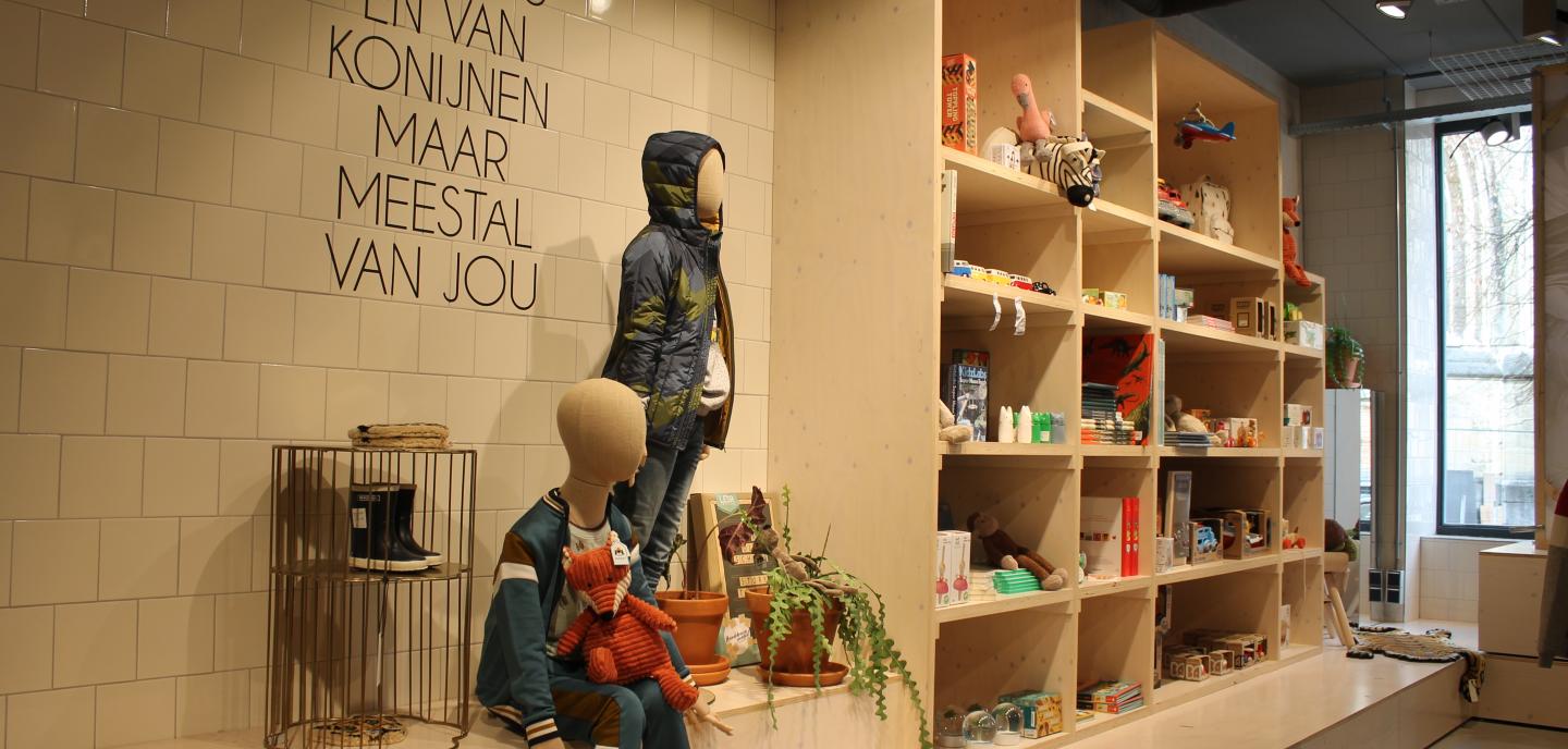
On the left behind the cash register, on a lower level, is the children's ward, which can be reached by a small staircase. Because this level is lower, you get an enclosed and safe feeling which makes children feel right at home. In this corner there are children's clothes, hung on the fixed white lacquered tube racks, and durable toys displayed in a plywood wall cupboard. For the fitting rooms we have chosen to make wooden houses the size of a child who will certainly have a good time there. These cubicles and the toys are an attraction for all the children who come into the shop.

To the right of the back of the shop is the men's section with a beautiful black metal spiral staircase as an accent in the room. This department distinguishes itself from the rest, because of the tougher and cooler atmosphere you immediately notice when you walk around the department. The fixed dark tube racks with their original colour also contribute to this, on which of course the clothing hangs. 

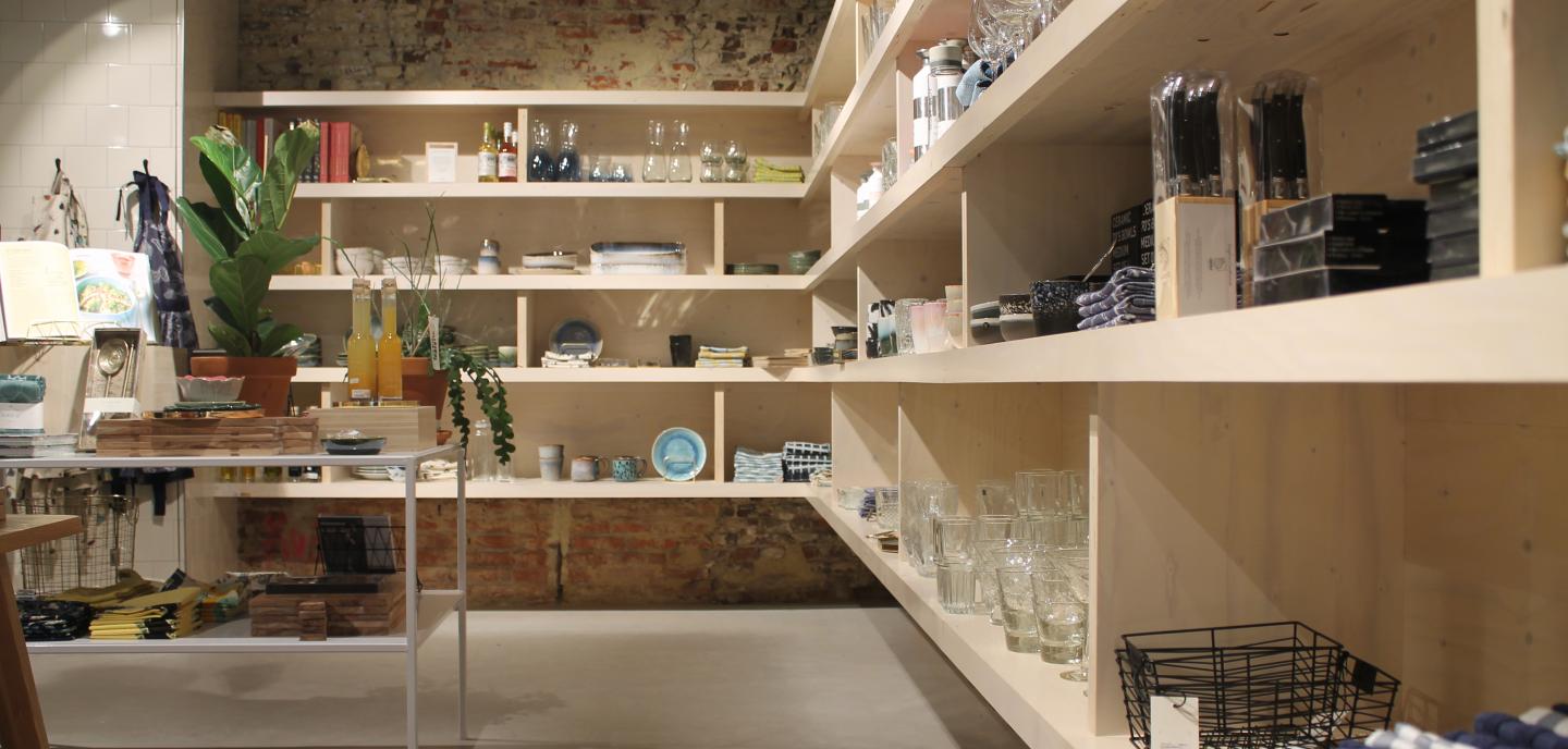
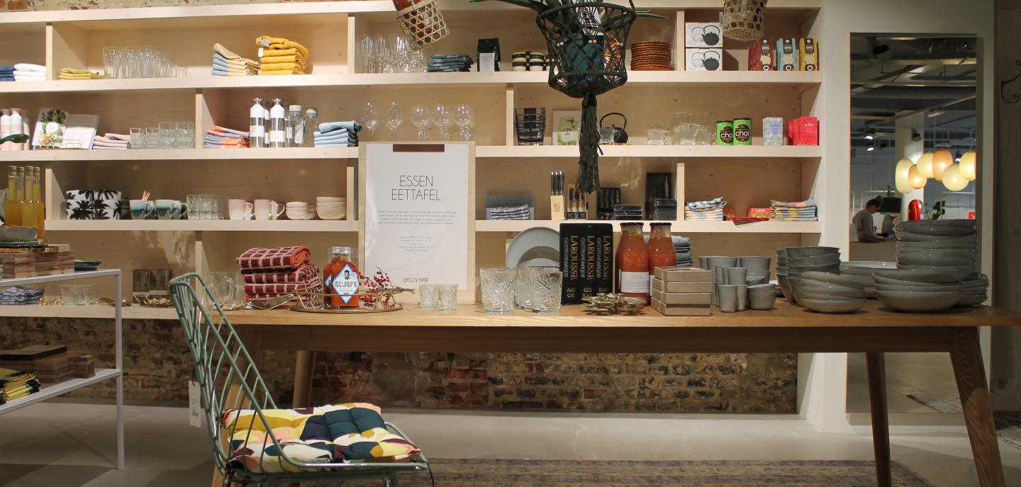
Fashion gradually turns into homeland and care products. These are displayed with the clothes so that consumers are triggered to browse further through all the items. The wooden presentation furniture exists in different shapes, sizes and finishes. In this department, products such as crockery, pots, vases, beverage cans, cookery books, cooking utensils, candles, aroma sticks, mirrors, table lamps, plants, etc.... are presented together. 

Furthermore, there are several cosy sitting areas made with a sofa, coffee tables, rug and lamps. Here, too, customers are attracted and stay a while to look at everything.

Because of the width of the range (food, clothing, interior, care, kitchen, bathroom, accessories and vintage) Sissy-Boy needs the space to come into its own.

So we can conclude that Sissy-Boy is a shop that has various aspects of experience and also thinks about sustainability. Despite the different departments in the shop, the use of materials and the return of elements in different ways and places create a beautiful whole. A cosy and warm atmosphere is also created by the use of many accents such as plants, nice quotes, mood lighting, ... Throughout the shop they have used different presentation models to present fashion to customers. They also communicate in a subtle way to the consumer which products are in promotion and what the new collection is by means of small signs on the shelves. Because it is a new building with the re-use of an old wall, you still get a relationship with the past and it is not just a modern building block. Daylight also plays a major role because it is let in on two sides, which ensures a pleasant experience of the space. Furthermore, at Sissy-Boy we place great emphasis on good service and customer-friendliness. They try to respond as consciously as possible to contemporary social trends. They do this by using social media as much as possible in addition to their website and webshop in order to stimulate customers.

Retailer story

The shop that started as a family business, namely Sissy-Boy, opened its doors for the first time in 1982 in Amsterdam. The initial goal was to inspire people in a homely environment. This idea refers to the Austrian Empress and also Queen of Hungary, Elisabeth of Bavaria.

The shop is named after Queen Elisabeth of Bavaria, also known as Sissy. She was against splendour in her castle and loved a more homely atmosphere. In the early years Sissy-Boy mainly had unisex collections, later they also introduced a men's clothing line. To make this clear, they added 'Boy' to their name.

Martina Vangeneugden

This homeliness translates not only in the arrangement of products, but also in the choice of materials in the interior such as the original brick wall and, of course, in the quotes they use.

The quotes can be read on our social media, in the shop window and even on the bags specially made for Sissy-Boy. We always get positive reactions to them, because they are always correct.

Iris Haine

Sissy-Boy works around themes that are linked to the collection of that moment. This theme translates into a story that is told in the shop, in the shop windows, in the quotes and on social media.

During the Valentine's period we told a love story called 'rendezvous'. This theme consists of four parts, the first of which is a date in Paris and thus grows into the fourth part which represents marriage. Here we sell clothes that are slightly more luxurious that you could wear to go to a wedding.

Martina Vangeneugden 

To put products in the spotlight, they use 'teasers'. These are exhibition blocks where they show combinations of the novelties or actions of the moment. To make this even clearer, Sissy-Boy uses signs or 'hang tags'.

Sissy-Boy tries to inspire people by combining clothes and home-country to create a story. They even go a step further by providing images in a lookbook, so you can see how you could combine the clothes.

Audit

If the DIY Fashion store audit for Sissy-Boy is completed, the following result is achieved:

DIY audit Sissy-Boy
Type: MAS

In this shop, the space (architecture of the building and the shop design) is equivalent to the product range. These two elements support each other in the retailer's story, but one is not more important than the other. Senses are stimulated, but this happens rather subtly, like a quieter seducer. The shop is balanced and inviting both in terms of form and content, which makes the threshold very low. The customer can both browse and shop pleasantly and purposefully.

Each type is accompanied by possible pitfalls

A possible pitfall with this type of shop is that little news happens, it is a shop like there are 13 in a dozen. The middle field in the figure is the image in which the majority of fashion retailers enter. Creating a more specific and personal experience can differentiate your shop from and give it a head start on the rest of the market.

Experience matrix

Although the sensory matrix is a design tool, we use it here as an evaluation tool to illustrate the use of the matrix.

In the top row are the 4 brand values of Sissy-Boy, followed by their type of product and the type of building they are in. The table shows what Sissy-Boy has bet on: which brand value has received which sensory translation. This tool can therefore be used during the design process to translate what the shop stands for into a suitable shop design.

+ & - points

When we test Sissy-Boy against findings from research and literature, we arrive at a list of very strong points in terms of the shopping experience on the one hand, and on the other hand, a few points of improvement that are necessary to further enhance the experience in the shop and to consistently convey the story that Sissy-Boy wants to tell.

Strenghts

HOMELINESS - The industrial interior with sober colours and materials acquires a warm and homely atmosphere through wood accents, plants and soft textures. This homeliness is also reflected in the arrangement of the products. This greatly enhances their vision (Pine & Gilmore, 1998).

MUSIC - In order to emphasize the homely atmosphere even more, Sissy-Boy has created its own playlist with carefully selected songs. Pop music was chosen to emphasize the positive atmosphere (Morin, Dubé, & Chebat, 2007).

FITTING ROOMS - Sissy-Boy has deliberately chosen to place a variant of fitting rooms in the different departments. In this way the consumer can fit in quietly and discover this department later on. For women, on the one hand, we opted for wooden fitting rooms that have a playful look, are large enough and have plenty of space to hang and/or put things somewhere (Ballantine, Jack & Parsons, 2010). On the other hand, we opted for fitting rooms with u-shaped rails where the space is demarcated with a curtain and a carpet to create a rich feeling (Karana, Hekkert, Kandachar, 2008). In the children's ward, wooden houses have been chosen that are children's size, have a playful/child-like look and immediately catch the children's eye.

INSPIRING - Sissy-Boy wants to immerse the consumer in a story, surprise and inspire them, which offers a unique experience (Pine & Gilmore, 1999). A combination of clothing and home-land creates a story. In this way they inspire the customer to make a creative and playful combination in his or her purchases. After a certain period of time, the combinations are adapted to a new theme that is told in the shop window and further reflected in products and their presentation. This continues to surprise the customers and always offers a new experience (Schmitt, 1999). You take this unique experience home with you through, among other things, the quotes, specially made for Sissy-Boy, which are printed on the bags.

GREEN POLICY - Throughout the shop there are plants that are sold as well as having an aesthetic function. They create a homely and cosy atmosphere (Bringslimark, Hartig, & Patil, 2009) that Sissy-Boy really wants to use. The plants are not only for decoration, but also bring tranquillity to the sometimes unwanted bustle (Brengman, Willems, & Joye, 2012).

CREATIVE FURNITURE - We have opted for sober made-to-measure furniture so that the focus is entirely on the products. This made-to-measure furniture is adapted to the department. For women and children, for example, we opted for white lacquered tubular racks attached to the ceiling to present clothing. Whereas men have deliberately opted for a tougher look. Homeland is presented on wooden furniture, because wood is associated with a warm, homely and natural material (Rice, Kozak, Meitner, & Cohen, 2006; Nyrud & bringslimark, 2010) which perfectly matches the homeliness that Sissy-Boy wants to radiate.

As an eye-catcher to present jewellery, a dark brown vintage piece of furniture has been chosen which immediately catches the eye between the other sleek shapes and soft colours.

TACTILE SENSE - Both the homeland products and the clothing can always be fitted and/or touched, which lowers the consumer's threshold. It also increases confidence in Sissy-Boy and the quality of the products they sell (Jansson-Boyd, 2011; Grohmann, Spangenberg, & Sprott, 2007; Lund, 2015; Peck & Childers, 2003).

MATERIALS -In the interior, we work mainly with sober materials, colours and complemented with wood accents and soft textures, which generates positive feelings among consumers as with hard, cold materials (Wastiels, Schifferstein, Heylighen, & Wouters, 2012). The use of real wood will accentuate the homely atmosphere, as this material is evaluated as warmer and cozier than a wood look (Jimenéz et al., 2016).

SERVICE - Customer focus is one of Sissy-Boy's hobbyhorses and provides a positive experience for the customer (Hwang & Chi, 2015). When entering, the client is warmly welcomed with a personal touch from the staff. Without being intrusive, you still have the feeling that the staff is always there for you if you have a question or just have too much in your hands, etc. Due to the knowledge of the products, the helpfulness and cordiality of the employees, the customer will have a positive experience when visiting Sissy-Boy (Kulkarni, 2013).

Improvements

OPPORTUNITY OF THE SCENT - A pleasant subtle scent can enhance the homely atmosphere that Sissy-Boy wants to radiate. If this fragrance is also congruent with the shop environment, the product range and the shop design, the customer will consider it pleasant and attractive. (Doucé, Poels, Janssens, & De Backer, 2013).  Sissy-Boy may opt for a soothing, floral fragrance that enhances the homely atmosphere. A scent can ensure that the customer retains a positive feeling about their shopping experience and has the intention to return to the shop more quickly (Krishna, Elder, & Caldara, 2010). 

CROWDED SHOPPING ENVIRONMENT - Sissy-Boy is very strong in combining home-country with clothing, but here there is also the danger that customers will get a cluttered and busy impression. This feeling can cause problems for customers (Addis, Sala, 2007). This unwanted hustle and bustle of products can be neutralised by introducing green in the shop (Brengman, Willems, & Joye, 2012). This not only provides tranquillity, but also a pleasant feeling without losing the surprise effect created by the voyage of discovery. White tones can also help bring back peace and breathing space (Oberfeld, Hecht, & Gamer, 2010).

If customers are led unconsciously through the shop, they will give in more quickly to an unplanned purchase (Inman, Winer, & Ferraro, 2009).

PRODUCT PRESENTED ON EYE LEVEL - In the children's section, additional accessories are displayed on top of the metal clothes racks. This is not within reach for every child. While it is the children who often persuade adults to buy that favourite accessory.

LEVELS - Sissy-Boy in Hasselt uses different levels on the ground floor. This is the positive and playful result of the building situated on a slope. However, the wheelchair user or parents/grandparents with a buggy who cannot easily move from one level to the other are not always considered here. This will cause frustration and consequently a bad memory of the shop.

STORE LOCATION - Sissy-Boy is situated in the centre of Hasselt, close to the big market. The ideal location you would think. Nothing could be further from the truth... because the shop is not located on the shopping street, people don't pass by so easily. As a result, Sissy-Boy has to make extra efforts to introduce customers to their unique experience shop. 

read our other case studies