Monar & Clothes

Monar & Clothes

Everdijstraat 35, 2000 Antwerpen
Description

[The Retail Design Lab wrote this case study based on an extensive analysis of (and in consultation with) the retailer in question using our tools and scientific insights. This case study is intended to be an instructive 'best case'].

Monar & Clothes is a concept store for men and women with a large, rather exclusive assortment of sneakers. It is the last new branch of the well-known Monar shoe stores (4) in Antwerp. Monar & Clothes offers a lot of products that are distributed exclusively in Belgium. Monar also designs its own models, sometimes in collaboration with other brands. In doing so, they allow young designers to present their new product range (e.g., Kupuri, designed by a Belgian designer). Monar is a family business that has been passed down from generation to generation. At this moment Tom and Els De Maeijer (brother and sister) are running the company. With their store, they want to communicate a familiar atmosphere so both staff and clients feel welcome. According to them, a store should be a place where one can look around, discover new things and explore. Monar & Clothes is located in an old school building with different spaces still named after their old functions: a library, a workshop, a nursery, a lab and a gym. As a result, the store is separated in five different concept spaces co-existing in one building. In each, a different experience is created with, among others, its own music!

The building was designed by Antwerp city architect Cornelis Floris de Vriendt (who also designed the city hall). It was later taken over by the church and turned into a school. PUURinterieur has re-designed the interior of the store. As many of the original elements as possible were retained and incorporated in the concept. When entering the building, for instance, the client sees the name of the original room on the wall (e.g. gymnasium). The product racks aren’t fixed and thus can be moved up or down (via hooks in the ceiling). The products are therefore constantly moving and the space is organized according to a story.  

Upon entry, the client can move in two directions: left where he/she will find the men’s department and right where the women’s department is located. 

A few original children’s drawings on the wall, treated to retain their colour, catch the eye in the first space of the women’s department. The merchandising of this space is often changed (usually on a monthly basis) to make sure that the experience of the customer is different each time he/she visits. As soon as someone enters the store, he/she should get the feeling that it is different, without losing the typical Monar identity. In addition to the clothing assortment and two fitting rooms, this space also contains a counter. 

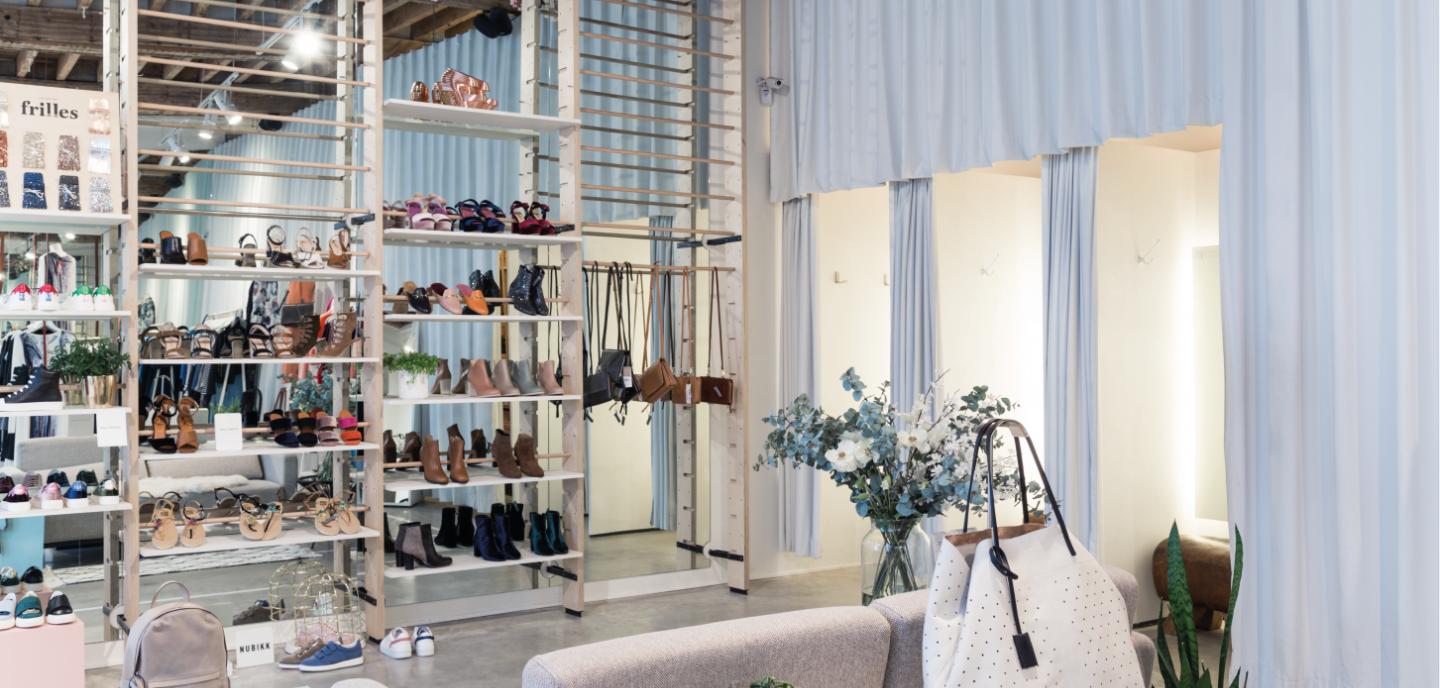
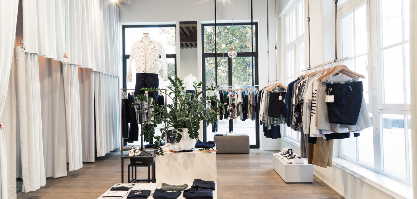
In what used to be the gymnasium, the women’s department is extended into a second space. The original function of the space is still visible in the design on the floor (coloured lines indicating the contours of the sports field). The same idea is also used in the rigid clothing racks and the gym equipment that functions as decoration in the room. In the fitting rooms, small gym blocks, instead of chairs, can be used to lay down items. Here as well, everything is modular. In this space, like in most others, a room-wide curtain hides the stock: on the one hand this is a necessity due to a lack of space, but on the other hand it is also very practical for the staff and customers. 

From the women’s department, one can cross a (partly open air) gallery to the men’s section. In summer when the weather is warm, the doors are open and there is a corridor between both departments. Often this courtyard is used for events. Apart from this, the gallery does not (yet) have a specific function.  

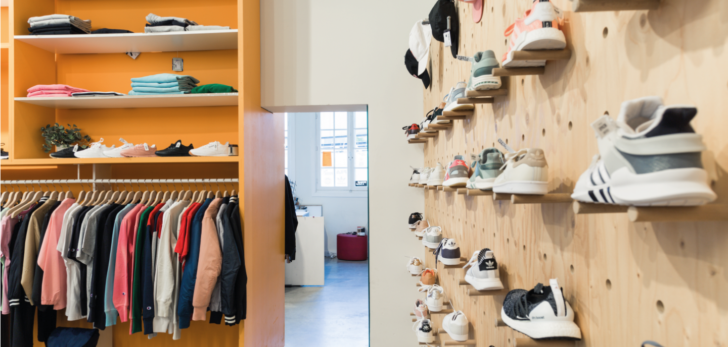
The “sneakers storyline” is very central in the men’s department. This story continues in the clothing line, although this doesn’t mean that other brands or styles aren’t included in the assortment. The first space of the men’s department at the side of the street is dedicated to newer (more sporty) brands as well as young designers. Here products are placed in the spotlight against a “Monar-orange” wall – a colour that also runs through their general communications (flyers, packaging, bags, etc.) It is in this area that the counter of the men’s department is located. In the next space, the ‘sneakers room’, all shoes are placed sideways on the walls to create a stronger display. All models are physically showcased. This is both a creative and functional solution, as otherwise the entire assortment could not be displayed due to a lack of space. This all takes into account the target audience and choice of materials (e.g. timber) to remain consistent with the intended image: not too classy, but still stylish and refined. 

A slightly smaller and cosier room is located behind the sneakers space. Here we find the exclusive products from brands, which are sometimes only available in 1 or 2 points of sales in Belgium. The brands themselves may choose which point of purchase exclusively distributes their products. Monar & Clothes always retains one of each product even after its sale has ended to allow sneaker fans to come and admire the item. Behind this smaller space is the ‘men’s room’, with a very different atmosphere due to, among other things, a different floor finish as well as different fabrics and materials with a richer feel compared to those used in the sneaker room. Here a more exclusive essence of timber is used. There is also a minibar so customers may enjoy a drink while trying on the products. 

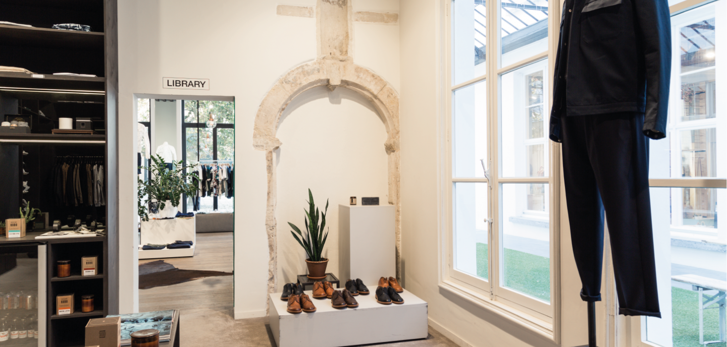
The last space is still under construction and thus the idea and concept are not yet finalised. In this space, we find a fresco covered by a protective glass plate and a capital. At this moment, this multifunctional space has a Scandinavian feel to it. Everything is modular, including the lighting, so that everything can be changed according to a specific function.

Retailer story
Tom De Maeijer’s story

Tom begins his story by telling us that experience is key at Monar & Clothes and that “unity” matters most - this is achieved through the story that is communicated to the customer. Monar & Clothes brings experience to the customer in multiple ways. 

In the first place, they create experience through a thoughtful product assortment. They, for instance, buy special limited-edition pieces of which one example is retained on display post-sale for sneaker fans. In this way clients can experience the (expensive) sneakers without having to purchase them. 

In addition, the brand strongly focuses on events. Indeed, in the past year and a half (since the opening of Monar & Clothes) they have already organized 13 events. The starting point is usually the launch of a new brand or product.

We don’t just organise an event, you need to create a story. For instance, we work with artists, with the Moortgat brewery, with Pernod Ricard or Absolut, etc. One of these events, around Pharell Williams’ sneakers, we organized in partnership with Sony. At this event buyers even received an exclusive record.

Tom

They include customers in the design process of new shoes. For example, some time ago two types of boots were displayed with a different heel type. The customers were asked to indicate their preference. The result of the survey was incorporated in the further design process. 

Secondly, Monar & Clothes stresses experience by bringing stories in the store. Their storyline has grown through the architecture and the location of the building.

We will never duplicate this storyline elsewhere. That is impossible given the strength of this particular building. It’s a magnificent building, but we also had our difficulties with it. For instance, we wanted to add canopies with our name on it in every window, but because it is a protected monument, we could not interfere with the façade so we could only attach a canopy above three of the windows where we would not damage the façade.

Tom

The building was completely designed in collaboration with Monumentenzorg (i.e. the building conservation office), so all of the original elements inside the building also needed to be retained. A 16th century fresco and a capital, a copy of which can be found in the British Museum, are located in the building.

I do not believe in adjusting colours and scent marketing, but I do believe in informing the customer and creating an experience by telling stories. Experience means for us to go ‘one-step-further’ by taking the consumer along in a story that grows organically.

Tom

The store is set-up in such a way that it is easily adjustable to a new storyline. The store design is very regularly changed so that the customer can re-discover everything over and over again. Tom explains that they chose very consciously not to start a web shop because the customer needs to experience the story inside the store.

We put a lot of effort in the website, which functions as a “look book”, and in social media, for which we have hired a dedicated employee. We do not work with print advertising, yet a monthly brochure is available in all our branches and it is given to customers when they make a purchase (+/- 70.000 per year).

Tom

The aim is to replace these brochures in term by direct mailing. Monar & Clothes works with a system where they register which brands are being sold to which customers. These customers will then receive additional information about these specific brands in their mailbox. In addition, Monar & Clothes gets a lot of exposure through the events they organize and by the reports that appear in the press or on blogs about these.

Audit

If you complete the DIY Fashion store audit for Monar & Clothes you will come to the following result:

< Under construction...>

Type: Taj Mahal

The store catches the eye due to its design (i.e. interior design of the store and the architecture of the building). It is this space that gives added value to the store and the products. Upon entering, the customer will first notice the architecture of the building or the interior of the store, and only then the products that are offered for sale. The layout of the store is clearly an element that sets the store apart from the competition. It exudes what you as a retailer stand for. The senses are more subtly used as a silent seducer.

Each type is accompanied by potential pitfalls

A possible pitfall with this type of store is that you have to be careful that the space is not too excessive/present. If the space attracts too much attention, this is at the expense of the experience of the products. Also be careful with spaces that are too decorative because these can quickly be seen as fake or not fitting.

Experience matrix

Although the senses matrix is a design tool, we use it here as an evaluation tool to illustrate its use.

In the upper row, the 4 brand values of Monar & Clothes are listed followed by product and building types. The table indicates the accents Monar & Clothes has chosen to stress: which brand value has been translated into which sensorial experience. This tool can be used to translate the essence of the store’s DNA in a suitable store design during the design process.

+ & - points

When we compare Monar & Clothes with the findings found in research and literature, we arrive at a list of very strong points in terms of store experience and a few areas of improvement to raise the experience level even more and to tell the story of Monar & Clothes in a more consistent way.

Positive points

A BUILDING WITH MEANING – Monar & Clothes chose to make use of the opportunities and showcase the added value of the protected building they occupy: not only by highlighting the exterior characteristics of the facade and the authentic elements inside the building, but also by using the non-tangible characteristics, the atmosphere, and the stories connected to the building. In this way, not only are products being sold, but also a social identity is being communicated (Ogle, Hyllegard, & Dunbar, 2004). The old building in itself is consciously used to bring an authentic story, which raises curiosity and touches the visitor (Plevoets & Van Cleempoel, 2016).

IMAGE – The choice of a highly trendy store location was specifically made to communicate that this brand stands out and that the client can expect something not mainstream but completely different. Monar & Clothes want to profile this branch in such a way that the image they communicate and the personality they wish to convey are congruent with the image of their target audience. Self-congruency theory explains that people will rather shop in a (clothing) store of which they perceive the personality to fit with their own personality (Sirgy, Grewal, Mangleburg, 2000; Willems & Brengman, 2011).

SERVICE – The staff is very specifically chosen for their product knowledge (Singh, Katiyar, & Verma, 2014), which boosts the confidence of the customers and also gives them the opportunity to receive the precise and knowledgeable assistance they seek in their choices. 

EXPERIENCE – As a concept store Monar & Clothes puts experience first as they want to offer something unique to their customers and immerse them in a story (Pine & Gilmore, 1999). By working with different moods in the multiple departments and also playing with the seasons and upcoming trends, they aim to surprise the client over and over again and to continuously offer something different (Schmitt, 1999).

FURNITURE – The furniture and shelves can be modified and are indeed changed regularly in their set-up. The sneakers department presents its shoes with a unique hanging system attached to timber-finished walls, which stimulates the customers to explore the product range (Cavazza & Gabrielli, 2015). By presenting the products in an original and unique way, the image Monar & Clothes wants to communicate is emphasised (Chan & Chan, 2008). They chose to work with timber, but in a sober finish with a more luxurious look. In addition, although timber furniture and shelves where chosen for the mental imagery they create (wood is perceived as “warm” as it is a natural material, gives a “homely” feeling, and feels pleasant to the touch (Rice, Kozak, Meitner, & Cohen, 2006; Nyrud & Bringslimark, 2010)), their eco-friendly use was also taken into account (Werner & Richter, 2007). The steel racks signal sobriety and hence shift the attention to the products. 

VISUALS – Eye catchers and strong detailing (such as the children’s paintings on the wall) draw the attention (Chan & Chan, 2007) and they trigger the curiosity of the customer (Pecoraro & Uusitalo, 2014). These drawings also tell the story of the building. It’s these details that add sense to the concept (Verhoef, Lemon, Parsuraman, Roggeveen, Tsiros, & Schlesinger, 2009).

MUSIC – Monar & Clothes comprises multiple spaces, each with a different style of music chosen to fit with the brands on display. A correct ‘match’ is most important for potential, new customers who don’t know the store or brands yet, because the music choice is a signal that communicates something about what the store or brand stands for, its image and its quality (Beverland, Lim, Morrison, & Terziovski, 2006). 

LIGHTING – The lighting is adapted to the different spaces and creates a feeling of cosiness. Well-selected light fittings help to convey a certain image and may enhance the identity of the retailer (Quartier, Vanrie, & Van Cleempoel, 2014).

CUSTOMER INVOLVEMENT – Wherever possible, clients are included in the design process and decisions regarding certain shoes designed by Monar itself. This way, the brand designers have a better understanding of the style of their target audience and, at the same time, the customer feels appreciated and involved since they are considered as creative partners (Florida & Goodnight, 2005). Organizing events like Monar & Clothes regularly does, also creates strong customer involvement (Sands, Oppewal, & Beverland, 2009). During themed evenings, interested customers are truly immersed in the story behind the brands, which may lead to a more positive attitude towards these and, as a consequence, towards the store as well (Foster & McLelland, 2015).

Areas of improvement

FACADE – As they are protected, signs may not be attached to the facades of the two building that form the location of the store. The store has tried to resolve this issue by placing a plastic patch of grass across the entire width of the facade. Although this material is functional, it doesn’t really fit with the identity of the brand or with the facade of the building. This creates a discrepancy between the overall appearance of the brand and this rather cheap solution (Kirby & Kent, 2010). 

DIVISION – As the rooms of the old school building were retained wherever possible, so were the names of their former use: ‘gym’, ‘lab’, or ‘library’. These names have little meaning to the customers and may cause confusion, especially to new clients looking for signage (Otterbring, Wästlund, Gustafsson, & Shams, 2014). It would be clearer if the story behind the building was explicitly communicated to the customers in one specific location. This would certainly create added value as it really does tell an authentic story. 

CONCEPT – The original fresco (protected by a sheet of glass) and capital, which take up a space in the building had to be retained; yet nothing is done with them so they, in fact, are a bit lost. They are nevertheless beautiful, original elements that could be integrated better in the design of the store and serve to highlight the story even more (Verhoef, Lemon, Parsuraman, Roggeveen, Tsiros, & Schlesinger, 2009). 

SCENT – There is an opportunity for a store with this type of image, clientele, product assortment and location to work with scent. This could be done in a part of the store only, for instance in the women’s department. Scents that are being diffused in a nice, subtle way and reinforce the image of the brand, and thus are congruent with this one, can positively influence the perception, experience, and evaluation of the store (Doucé, Janssens, Swinnen & Van Cleempoel, 2014).

read our other case studies