Dille & Kamille

Dille & Kamille

Maastrichterstraat 38, 3500 Hasselt
Description

[The Retail Design Lab wrote this case study based on an extensive analysis of (and in consultation with) the retailer in question using our tools and scientific insights. This case study is intended to be an instructive 'best case'].

Dille&Kamille involves the customer in their story through storytelling, through the story of their origins hanging along the checkout, through social media and through the chalkboards placed along and with the products. Through a link between these different ways, the customer is inspired and the experience is guaranteed.

Dille&Kamille is a chain of shops that is present in every major city. It is a non-fashion store that focuses on cooking and living. Typical for Dille&Kamille is attracting all ages. Not only the typical instagram-hipster who is looking for a new pair of sanseveria's to share via social media, but also the banal in-office worker who is looking for an ecological cleaner to wash off the stains on his costume caused by his chicken curry sandwich. It's a shop that appeals to a wide audience where everyone can find something they need.

This Dille&Kamille shop is the first in Belgian Limburg. The shop is located in the Maastrichterstraat in Hasselt and can be accessed via the famous Kadettsteeg. It is a very theatrical, well-known building with a beautiful location in the heart of Hasselt. The shop still pays a lot of attention to its values (green, homeliness, simplicity and sustainability) and combines these with a homely atmosphere. This creates an original and special ensemble in and around the shop.

The shop attracts the attention of passers-by because of their unique and creative way of dealing with the outdoor space.

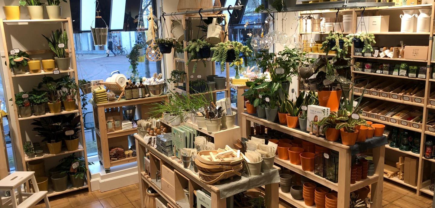
When entering the shop along the Kadettsteeg, the building will be fully highlighted. The viewing line through the alley is supported by the length of the building. The modest wooden door brings the consumer into the world of Dille&Kamille. Immediately, the countless greenery welcomes the consumer after which he or she follows a linear route to the end of the shop, the food corner. Tactical, by the way. Along the way, you can see the entire shop and all its categories. And who walks past a bulbous, friendly cactus that gets adopted for a euro?

The building is divided into three departments, i.e. green, rest and relaxation and cooking. As mentioned, the customer enters the green department, which immediately gives the homely feeling an enormous boost and a good first impression. Dill and camomile believe in the power of 'green' in your own outdoor area. This department extends all the way to the cash register in the rest department. The original staircase is used as a display window, which again creates a homely feeling in your hand.

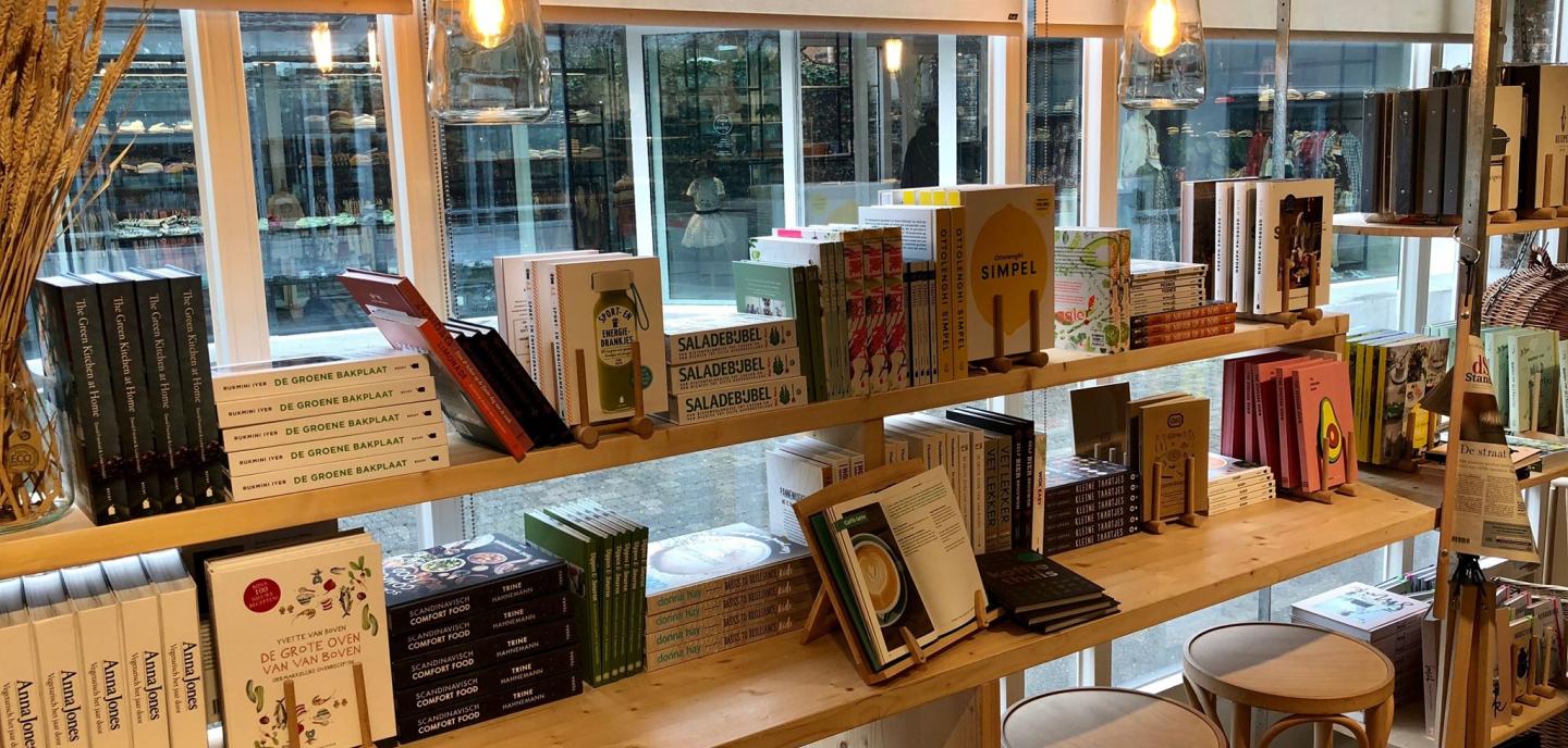
The green area is continued by the relaxation area. In this department we find the products that will transform your home into a finer place without breaking the peace and quiet. Here we take great care of tactility because of the different textures of the towels, flannels, sponges, soaps and candles, among other things. The latter products provide a pleasant and appropriate natural scent.

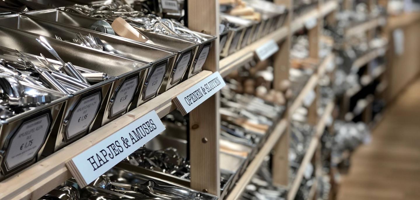
Finally, cooking is the last and largest department. The wooden floor creates a visual boundary between the two departments. First of all, Dille&Kamille exhibits their cooking instruments, which are followed by the food corner and the seating area, which are also visible from the outside, thus ensuring that the passer-by possibly becomes a customer. The consumer can taste the products themselves, which creates confidence in the product and the shop, resulting in higher sales.

Retailer story

Dille&Kamille's shops are a fixed value within the Belgian and Dutch shopping cities. The chain started as a simple market shop on the Utrecht canal in 1974, selling distinctive mixes of authentic products. Their assets at that time can still be seen in today's shops.

It was important to pay attention to the values of timelessness, ecology and naturalness. This was the case then and it is still the case today.

Bert, manager Dille & Kamille Hasselt

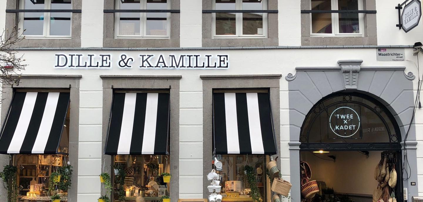
The Dille&Kamille shop is located on the Maastrichterstraat in Hasselt, a place where four streets converge. The shop can be entered via the Kadettsteeg which runs along the entire length of the building. The black and white recognisable logo immediately catches the eye, as do the black and white striped awnings and the countless products on display outside.

This way of displaying is typical of any Dille&Kamille shop. Outside, there are lots of articles to arouse people's curiosity and lead them inside, a bit like the principle of a market.

Bert, manager Dille & Kamille Hasselt

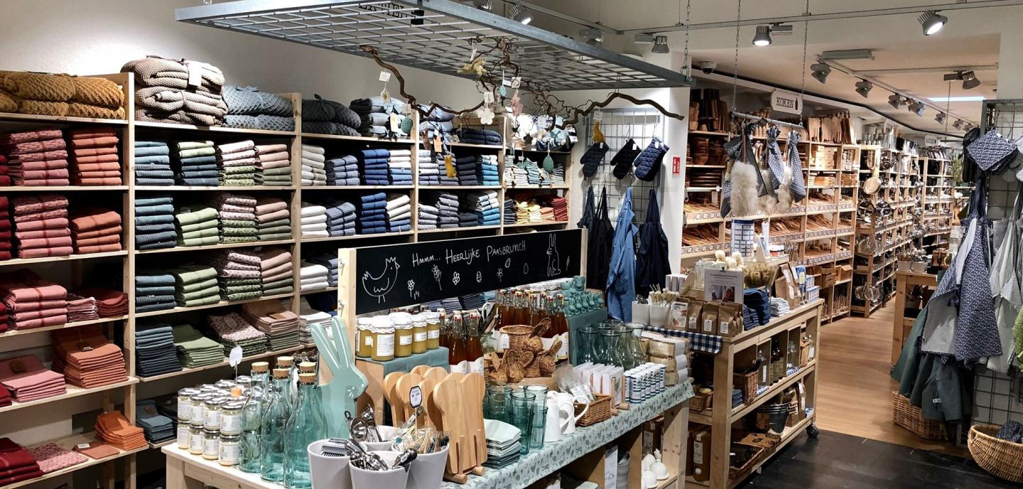
They also continue this way of displaying in the shop. Different tables, organised by theme and seasonal, equally enhance the nostalgic feeling of market stalls.

So our former concept remains very visible in today's shops.

Bert, manager Dille & Kamille Hasselt

In addition to this market principle, creating homeliness is also indispensable at Dille&Kamille. This value is guaranteed by their choice of having classical music played.

This is unique, because in most shops there is busier music playing. This phenomenon, too, is a kind of 'preserved tradition' of the past. Classical music makes customers feel at ease, just like the shop staff.

These have collaborative projects with organisations that are involved in classical music on a daily basis and also sponsor classical concerts, for example. 

Bert, manager Dille & Kamille Hasselt

Owned by Dille&Kamille shops is a food corner that can be used to let customers taste their own products. As a result, the customer is actively involved in the shop concept, which in turn ensures a pleasant taste experience and the natural aroma present in the shop.

Bert goes on to say that a conscious choice has been made to use sober, soft materials such as natural-coloured wood and white-painted walls.

Extremely light materials make the products stand out better and make people feel at ease. Nothing too 'loud', no bright neon lighting. The whole interior is soft and 'natural'. Nothing or as little as possible electric or with batteries.

Bert, manager Dille & Kamille Hasselt

Black soap, soap flakes, mortars etc. Are authentic products that fit perfectly within the Dille&Kamille framework. They try to dress up the nostalgic products in a contemporary way. Bert tells us that polls are regularly posted on social media where customers can give their own story and tips about a particular product.

This is the first shop of Dille&Kamille in Belgian Limburg. When the building became vacant, we immediately opted for it. The alley is also ideal. It is a very nice, well-known building with a beautiful location, right in the centre of Hasselt.

Bert, manager Dille & Kamille Hasselt
Audit

Completing the DIY Fashion store audit for Dille & Kamille produces the following result:

Type: MAS

In this shop, the space (architecture of the building and the shop design) is equivalent to the product range. These two elements support each other in the retailer's story, but one is not more important than the other. Senses are stimulated, but this happens rather subtly, like a quieter seducer. The shop is balanced and inviting both in terms of form and content, which makes the threshold very low. The customer can both browse and shop pleasantly and purposefully.

Each type is accompanied by possible pitfalls

A possible pitfall with this type of shop is that little news happens, it is a shop like there are 13 in a dozen. The middle field in the figure is the image in which the majority of fashion retailers enter. Creating a more specific and personal experience can differentiate your shop from and give it a head start on the rest of the market.

Experience matrix

Although the sensory matrix is a design tool, we use it here as an evaluation tool to illustrate the use of the matrix.

zintuigenmatrix dille&kamille

In the top row are the 4 brand values of Dille & Kamille, followed by their type of product and the type of premises they are in. The table shows what Dille & Kamille has bet on: which brand value has received which sensory translation. This tool can therefore be used during the design process to translate what the shop stands for into a suitable shop design.

+ & - points

When we test Dille & Kamille against findings from research and literature, we arrive at a list of very strong points in terms of the shopping experience on the one hand, and on the other hand, a few points for improvement that are necessary to further enhance the experience in the shop and to consistently convey the story that Dille & Kamille wants to tell.

Strenghts

SERVICE - The staff is trained very specifically with product knowledge in the different departments and of the older products. You also notice that they act as ambassadors of Ikea, which gives confidence to the customers (Singh, Katiyar, & Verma, 2014).

VISUAL MERCHANDISE - The products are more or less equivalent to each other and speak for themselves, without the need for an eye-catcher. They stimulate the amazement, nostalgia and curiosity of the customer (Pecoraro & Uusitalo, 2014). Visual merchandising is well thought-out and themes are explored in detail. The products are also used as a means of communication (e.g. by hanging them very visibly and high up), thus increasing the positive evaluation not only of the products but of the entire shop (Cavazza & Gabrielli, 2014).

TACTILE SENSE - All products can literally be touched without hesitation, which lowers thresholds (Ballantine, Jack, & Parsons, 2010) and thus conveys a positive feeling to the customers. It also gives more confidence in the retailer (Jansson-Boyd, 2011; Grohmann, Spangenberg, & Sprott, 2007; Lund, 2015; Peck & Childers, 2003).

ATMOSPHERE - The fun set-ups of the products, the visual merchandise and working with sober colours and colour combinations highlight the creative element and nostalgia of Dille&Kamille (Kent, 2007).

MIXED-USE - In addition to buying interior items and plants, customers can taste Dille&Kamille's products in the food corner. This creates confidence in the product and allows customers to decide for themselves whether to buy it (Grant & Perrott, 2011).

CROSSCHANNEL - Dille&Kamille also relies on social media, polls where consumers can express their specific use of traditional products. Online and offline co-exist to meet the customer's needs and expectations (Blazquez, 2014). Feeling and story are also extended online so that the customer is immersed (Verhoef, Leon, Parasurama, Roggeveen, Tsirios, & Schlesinger, 2009) in the world of Dille and Kamille.

PRESENTATION FURNITURE - The products are displayed on specially designed presentation furniture; this encourages buying behaviour, unlike if the same products were hanging on the shelves (Cavazza & Gabrielli, 2015). Dille&Kamille is playing hard and fast on this principle. The finishes and textures contribute to the creation of different atmospheres.

MEANINGFUL BUILDING - Dille&Kamille has chosen to showcase the opportunities and the added value of the property, as well as the well-known 2X KADETT lane that runs along the property. The old building itself attracts and is deliberately used to tell an authentic story, it immediately arouses curiosity and touches the visitor (Plevoets & Van Cleempoel, 2016). The location is also a great added value.

SCENTS - The scents present at Dille&Kamille come from natural products and tastings. No artificial fragrances are spread. When there is a similarity between product and fragrance, the customer will be more positive towards the products on offer and even towards the shop in general (Doucé , Poels, Janssens, & De Backer, 2013). Also when, according to the customer, the scent match the look and feel of the shop, he will retain a positive feeling about the shop and be more inclined to come back (Krishna, Elder, & Caldara, 2010).

FURNITURE - The furniture and shelves change regularly. In many places the choice was made to work with natural-coloured wood, taking into account the eco-friendly use of that material (Werner & Richter, 2007). In addition, wood is also associated with a warm material, it is a natural material, it gives a feeling of home and makes you feel comfortable (Rice, Kozak, Meitner, & Cohen, 2006; Nyrud & Bringslimark, 2010).

Improvements

PRODUCTS NOT (ALWAYS) ON GRIPPING HEIGHT - In the cooking area, products are presented in a wooden rack. The whole looks nice but doesn't always work in a practical way: sometimes customers have to take a stepladder or bend down in front of the desired instrument. Often customers will not make the effort to take the stepladder effectively. These movements require extra effort, are uncomfortable and can make the customer not feel good in the shop (Ballantine, Jack, & Parsons, 2010).

SIGNING - Although there are signs on the chalkboards and on the racks themselves, they are not visible enough for customers because other things in the immediate vicinity attract more attention. There is confusion and for some people frustration because they do not immediately find what they are looking for. Unclear signage has a demotivating effect when shopping and can stop the customer from a next visit (Sherman, Mathur, Belk Smith, 1997; Otterbring, Wästlund, Gustafsson, & Shams, 2014).

punten

read our other case studies