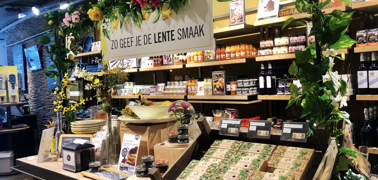
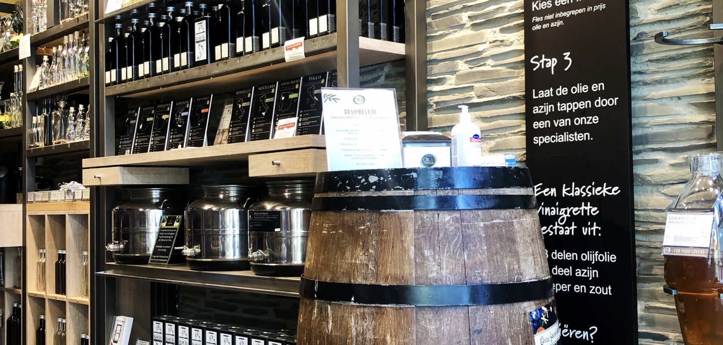
VISUAL MERCHANDISING - Oil & Vinegar uses many visual elements to advertise. They do this by putting a number of products in the spotlight by showing examples of gift packages, clear product designations and screens. (Fister, 2009).
COLOUR - Various warm colours are used on the shelves where the products are placed (Wastiels, Schifferstein, Heylighen, & Wouters, 2012). Together, these colours create a beautiful coherent and balanced whole (Bellizzi, Crowley, & Hasty, 1983). The use of colour fits in very well with the Mediterranean atmosphere that hangs in the shop.
SCENT - When entering the shop you can immediately perceive the scents of the products. These also help to create the Mediterranean atmosphere, invite you to taste them and make the customer linger longer in the shop (Spangenberg, Crowley, & Henderson, 1996) (Mattila, & Wirtz, 2001) (Knasko, 1989).
SERVICE - People are professional and knowledgeable. Staff members are thoroughly informed about the products they sell and are thus able to provide customers with the necessary service and information at all times. (Singh, Katiyar, & Verma, 2014).
MUSIC - To bring the Mediterranean atmosphere even more to the visitors, they have chosen the typical Mediterranean salsa music. In this way they respond to people's mood and indirectly try to create even more of a holiday feeling in a very subtle way. (Morin, Dubé, & Chebat, 2007).
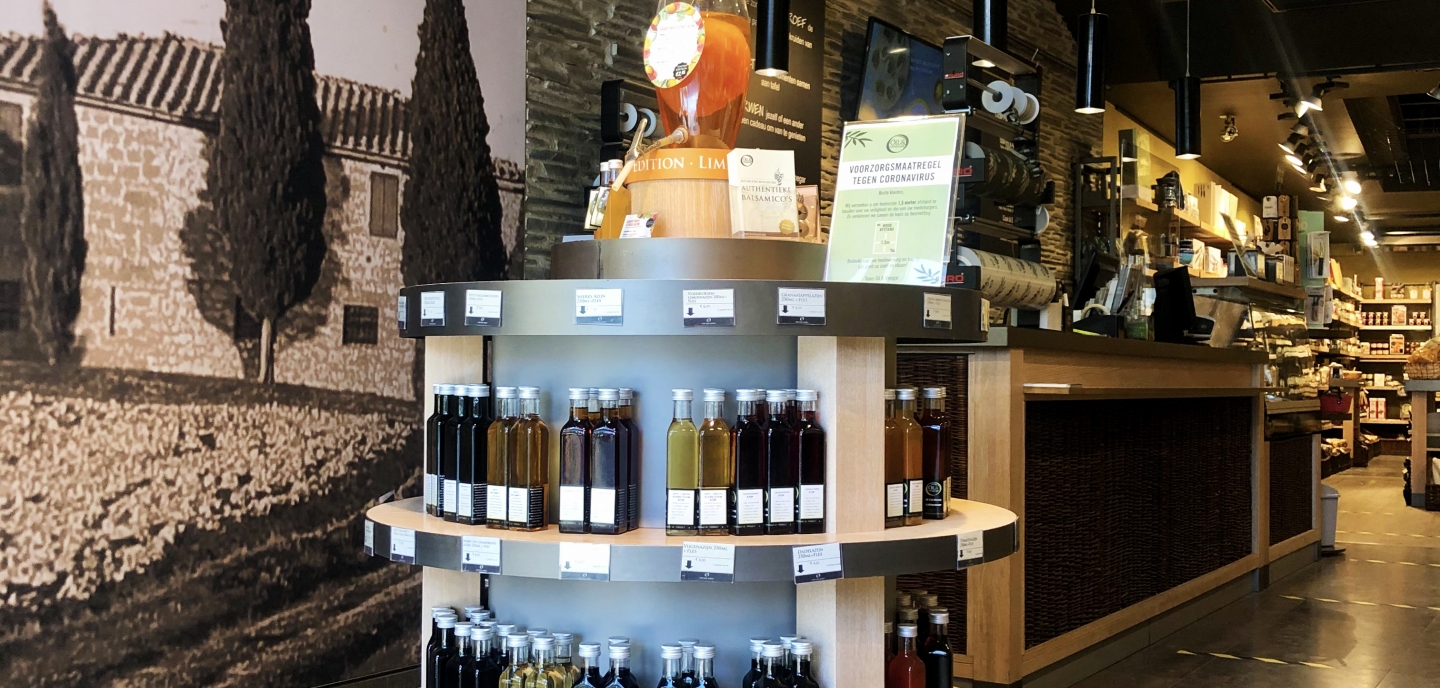
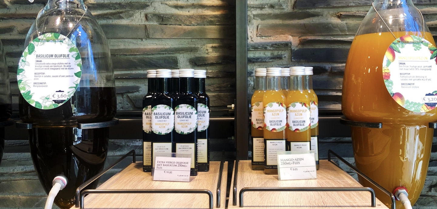
SIGNING - Oil & Vinegar clearly uses different types of signage in all its shops, such as the striking chalkboard, information boards,... These are all located in a conspicuous place so that customers can find them quickly. In this way everyone immediately knows what they are looking for or looking for. (Sherman, Mathur, Belk Smith, 1997; Otterbring, Wästlund, Gustafsson, & Shams, 2014).
COLOUR - The ornamental stones on the wall in combination with tightly painted green walls immediately give you a Mediterranean atmosphere. The rough stone in combination with the smooth green paint gives you an immediate warm feeling. (Fenko, Schifferstein, & Hekkert, 2010; Wastiels, Schifferstein, Heylighen, & Wouters, 2012). The green colour gives you a positive feeling, makes you feel at ease and stimulates strolling through the shop. (Akers, Barton, Cossey, Gainsford, Griffin, Micklewright, 2012).
TASTING - The tables with tastings on entry invite you to really get a taste before entering the rest of the shop. It is a large round table so you 'dare' to taste something because the table is large and offers a lot. After you have tasted several things from the table you will only enter the rest of the shop and you will want to buy this product more easily. You have the feeling that you are not doing anything wrong because you have tasted it and you have been able to compare the product. (Noppe, 2012)
MATERIALS- The wooden oak floor creates more atmosphere and the dark wood gives a warm feeling. The use of real wood is still associated and evaluated as warmer and cozier than a material in wood look or than the use of laminate (Jimenéz et al., 2016).
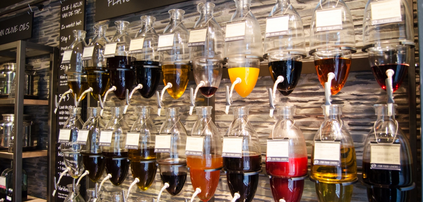
EYECATCHER- The amphora wall in front of the shop lures you in, because from the shopping street you can see the impressive wall with oil barrels. It is a real eye-catcher in the shop and the barrels are made of glass so you can see the different oils in the barrels. You want to know exactly what is inside and how it works, it is an experience in itself. (Chan &Chan, 2007)
TACTILE SENSE - All products available at Oil & Vinegar can be touched at any time by the visitor, which lowers the threshold for the consumer. In this way you have more feeling of trust. (Jansson-Boyd, 2011; Grohmann, Spangenberg, & Sprott, 2007; Lund, 2015; Peck & Childers, 2003).
CROSSCHANNEL - Oil & Vinegar also focuses on social media and has a webshop: online and offline co-exist to meet the customer's needs and expectations (Blazquez, 2014). The Mediterranean feeling and story of the shop chain are extended online and form a whole with the story in the physical shop so that the customer is always and everywhere immersed (Verhoef, Leon, Parasurama, Roggeveen, Tsirios, & Schlesinger, 2009) in the world of Oil & Vinegar.
STORE LAY-OUT - There is a clear subdivision per 'world'. So you can clearly see that the oil and vinegar barrels are presented differently from the herbs. This makes it possible for the customer to experience the different categories in a targeted way in the shop, which makes it much easier to search for a specific product (Elbers, 2016).
PRODUCT VISIBILITY/PRODUCT PLACING - The most attractive products are at eye level, the less attractive and packaged products, such as packs of pasta, are on the floor. This creates a clear and calm image.
PRESENTATION OF THE PRODUCT - The racks are not overfilled. For example, there could have been many more units of the same product, making it look busier. They haven't done this, which makes the products on the shelves stand out more.

